Bland Is Not a Brand.
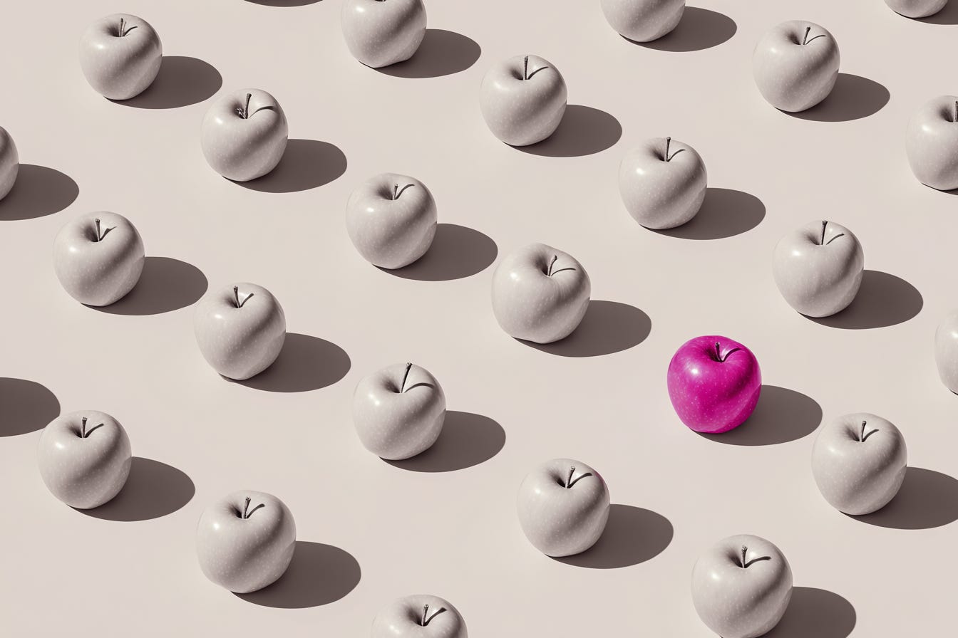
Why the great strip‑back is leaving some brands… well, naked.
Somewhere between last year’s rebrand and this morning’s coffee, your favourite brand vanished. Not from the world — but into a blur of beige packaging and polite sans‑serifs.
It’s not just the retail floor. Scroll your feed and you’ll see it too: skincare, fashion, homeware and tech brands starting to look… conspicuously related. Same muted tones. Same tidy product shot on a textured surface. Same logo that could belong to anyone.
Across industries, brands are undergoing an aggressive wardrobe edit. Out go decorative logos, nostalgic mascots, distinctive shapes and proud colours. In come the pared‑back palettes, neat grids and logos so clean they leave no trace. It’s called blanding — minimalism without the memory.
Minimalism Isn’t the Villain
I’ve built many refined identities over a 25‑year career. I’ll admit — I’m guilty of leaning hard into stripped‑back palettes myself. Often, I’ve worked with a monochromatic stage to let imagery and storytelling breathe. Done with intention, minimalism sharpens focus and gives space for character.
But less only works if there’s still something to hold onto. When brands confuse editing with erasing, they don’t gain clarity — they lose distinction. Have you noticed how easily that happens when the pressure is to ‘simplify’ fast?
The Design Code: A Brand’s DNA
The strongest brands are bound by an invisible thread — a design code. It’s the considered orchestration of type, colour, photo/video/mograph direction, proportion, layout rhythm, a distinctive brand‑coded pattern, custom‑tooled components, purposeful packaging details, and iconography — all working in harmony to create intentional recognition.
It’s what makes a DS & Durga bottle feel deliberate before you’ve even read the label. How Nécessaire has turned minimalism into a tactile, ownable visual language. How StrangeLove is proof that restraint can be an unexpected — and deliciously evocative signature.
When brands strip back without protecting that code, they’re not simplifying — they’re severing their own thread.
Blanding: Minimalism Without Memory
Blanding flattens. It swaps quirks and cues for corporate beige — tidy, palatable, forgettable.
It’s often the result of risk‑averse decision‑making or design engineered to pass the scroll test: safe, algorithm‑friendly, easily replaceable. And in the pursuit of ‘modern’, brands often scrub away the elements people loved — the cues that anchored trust, sparked loyalty, or simply felt human. I’ve seen it happen to well‑intentioned rebrands — the kind that set out to be clean and modern, but accidentally sanded away the soul — often at serious cost.
Blanding is what happens when you mistake the thrill of revolution for the craft of evolution.
Editing with Purpose
Refinement isn’t about stripping out everything you can. It’s about protecting what matters most. Strong brands evolve without losing the shorthand that says: you know us, you trust us.
And in a world of Pinterest‑inspired, off‑the‑shelf logos and Canva templates, branding — real, crafted brand building — matters more than ever. Tools can create something that looks like a brand, but looking like one isn’t the same as being one. And perhaps that’s the crux — when design isn’t your first language, the tools can end up speaking louder than your intent.
“Brands are trading creativity for convenience… in a world of sameness, standing out is the real competitive edge.” — Bob Lawrence
Minimalism should be about clarity, not conformity. About distilling essence, not filing down edges. The real question is — what are you keeping, and why?
Resilience, in Design Form
A good design code is like a strong foundation. It lets you renovate without worrying the whole structure will collapse. It offers range, flexibility and resilience.
It’s what stops minimalism from becoming blanding. It’s what allows change without confusion. It’s what keeps a brand alive and visible in that sea of beige packaging and polite sans‑serifs.
Choose Your Lane
Minimalism can make a brand sharper.
Blanding makes it disappear.
The strongest brands know the difference — and protect the details that make them unmistakable.
Because bland might be tidy. But it’s not memorable. And in branding, forgettable is the one thing you can’t afford to be.
So while everyone’s speaking in whispers, dare to keep your accent. It’s your most authentic inheritance — and the one impression you can’t afford to lose.
More pieces from Substack.



Sign up to subscribe.
Independent thinking on brand, creativity, and the ideas shaping both.
Connect.